
Sign Monopoly
What’s the sitch with the sign monopoly?
I was recently driving the street that stretches from my place to the nearby grocery store, when the 20,000th stop sign I’ve seen in my life came into focus (give or take a few thousand). As you might guess, this was an unremarkable moment. I slowed my car nearly to a stop, pumped the brakes once, twice, then accelerated through, as we were all taught to do in driver’s ed.
“Keep on! With the force don’t stop. Don’t stop ’til you get enough. Keep on!” M.J. is a little too passionate for a simple trip to get groceries. I changed the radio station.
“I saw the sign. And it opened up my eyes, I saw the sign. Life is demaaanding, without understaaanding. I saw the sign…” Ace of Base is well known for their poetic depth, but I wasn’t in the mood.
“Stop! In the name of looove. Before you break my heaaart. Stop!” I decided to ride the rest of the way in silence.
I felt an itch on my neck and reached to scratch it. But the discomfort persisted, just below the surface. My subconscious was wrestling with some pattern, some input received, trying to make sense of it to deliver a clear message upward… before it was too late.
I approached the store, stopping one last time before crossing an intersection and taking a right into the lot.
I came to a halt, mostly within the white parking lines, and killed the engine. Sitting in the dark car, the glowing store lights reflected onto the windshield. “Pots Foods,” appeared as “sdooF stoP…” And then it all hit me, like a tidal wave crashing ashore. The scene outside of the car blurred and the interior began to close in. I put my head in my hands to keep the world from spinning, and was only just able to pry the driver’s door open in time to vomit once onto the cracked asphalt.
The stop sign I had just passed looked exactly like a stop sign I saw earlier in my journey. And that stop sign looked identical to the all of the stop signs I had seen in the previous month.And those stop signs were no different than the multitudinous red octagons I had been stopping in front of since first pressing my foot to the gas pedal when I was but 16 years old.
I pulled out of the grocery store parking lot without getting supplies for the night’s supper. I was no longer hungry.
I had the arm goosebumps of someone who had just stumbled upon a full-fledged conspiracy. The library was open for another hour; perhaps I would find answers in their yellowed stacks of newspaper clippings. I needed a reasonable explanation for why all these signs were identical.
Long, tedious story short, I did not find any answers in the five decades worth of local news headlines I perused. And all of the internet-connected computers at the library were being used by pre-teens Facebook chatting or playing Candy Crush or some shit. It’s like they don’t even care about what’s going on outside the confines of their internet prisons, man. To get this point across definitively, I shook one of the twerps, yelling loudly in his face, “Wake up bro!! The world is burning and those bright colors on the screen aren’t going to save you from the inferno!!”
I quickly scanned for a way to escape before the plodding library security guards could escort me out against my will. One path to freedom was illuminated by glowing red letters reading, “EXIT,” in all caps. The hair stood up on my neck. Isn’t that the same font as the EXIT sign I had seen the day before in the mall? And I swear it’s identical to all of the EXIT signs at my old school. What is that font anyway, is that San Serif? No, no not quite. Trebuchet MS perhaps? What are the odds that all of these EXIT signs have the exact same font, a font that is almost Helvetica, and yet, somehow eludes specific font classification?! What are the odds?!
The security guard assured me he did not know the precise odds, but that I did have to leave the premises immediately, by way of the door illuminated with the EXIT clone. The corruption went deeper than even I could have guessed.
My drive home was punctuated by nauseatingly similar signs telling me when and where to stop. God damn it, is there no freedom left?! Who stood to gain from this apparent sign monopoly? How high up did this go?
I could trust no one. Every smiling neighbor turned to sneering informant, every friendly postman a microphone-wielding undercover. I locked the door behind me and pulled the shades, ready to bunker down for a night spent in the dark corners of the interwebs.I gained access to wikipedia.org without much trouble. Could they be so careless as to store all of their secrets in one location? The hubris of great power will always be its downfall.
Leaning toward the screen, soft light illuminated my worried features. In 1935, the United States created the first Manual on Uniform Traffic Control Devices (MUTCD). At 166 pages long, it was not only extremely boring, but also too thick for any bystander to get through; the writers preferred it that way. This first version of ‘The Manual’ recommended a yellow stop sign with black letters. Shocking stuff.
In a 1954 revision of the document, the committee drastically changed course, calling for stop signs to be red with white letters. They claim the red color was desired from the beginning, because red has always been associated with “stop.” But it wasn’t until the 1950s that companies were able to produce a reflective red material durable enough to withstand the elements. So you’re telling me red is inherently less sticky than yellow? I’m no reflective paint expert, but I’m also not an idiot.
Even assuming they are being honest about the differences between yellow and red sign materials, the MUTCD at no point explained their basic sign color logic: that red has always been associated with stop, so therefore they will continue that tradition. But who decided upon this association? And more importantly, who stands to gain from it?
After digging a little further I stumbled upon an astonishing piece of the puzzle. As it turns out, both blood and fire are red. Both of them. And both have been around a long time, and both are usually associated with danger, pain, or power. So that’s it? Red = Danger = Avoid = Stop = Sign?
That’s not quite enough to justify a world where the CEOs of companies making red reflective paint own mega-yachts anchored off of secluded isles in the Mediterranean, while their counterparts at companies making yellow or blue or purple reflective paint own naught but small skiffs docked on humble coastlines in Florida.
I called a few nerdy scientist friends of mine, to ask their opinions. They were upset to be woken so late at night, because they are such nerdy scientists. But they could hear the urgency in my voice, and gave the best counsel they could, given the circumstances.

One particularly nerdy one reminded me, the color red has the longest wavelength of all the hues in the visible spectrum. Violet has the shortest, followed by blue. White light scatters when it contacts gaseous molecules, with the amount of scatter inversely related towavelength. So the shorter the wavelength, the more scatter, which, in the simplest of terms, is why the sky is blue.
(You may then ask, well why isn’t the sky purple? Which would be a logical question. This sitch isn’t really about the color of the sky as much as getting to a conclusion on the stop sign issue, but briefly: the sun emits more energy as blue light than violet, and our eyes are more sensitive to blue light than violet, therefore, even though violet light would be scattered more than blue or indigo, the sky is vermillion. Really a shame, IMHO.)
When white sunlight hits our atmosphere the blue wavelengths scatter diffusely, painting the heavens blue. Sunsets are red because light has to pass through more atmosphere to reach our eyes, and nearly all of the purple through green light is scattered en route, leaving only the long wavelengths to reach our eyes. This relationship is also the reason red light is easier to see from far distances. Thus, rescue signals and blinking lights on towers (etc.) are often red… and this is another reason given for why red stop signs make the most sense.
Like many conspiracies, logical explanations exist, and are enough to satisfy most casual investigators. To keep the worker bees from asking why their queen gets to sit in the hive and be fed all day. But I wasn’t satisfied. I had started pulling the end of a thread and needed to keep tugging until the ball of yarn could no longer hide secrets in its soft, colorful center.

I read on. The International Organization for Standardization (whose acronym is ISO for some dyslexic reason) promotes worldwide proprietary, industrial and commercial standardization. Founded in 1947, it was one of the first NGOs granted consultative status with the United Nations Economic and Social Council. They set the standards for the modern international green pictogram EXIT signs (among many other things), which are ubiquitous in Europe and Asia, though somewhat less common in the United States. New York City requires them in skyscrapers and high-rise apartment buildings, as do other major metropolises.
Again, this all appears well and good. Standardized signage to reduce confusion during emergencies seems noncontroversial. But who are these ISO people, and are we sure they don’t have other motives? Why isn’t their acronym IOS, if they are truly in the business of clear, standardized communication?The ISO is funded by subscriptions from the 162 member countries, in proportion to each country’s gross national product. It is also funded by the downstream organizations that manage specific projects, i.e. designing and implementing new EXIT signs. And lastly they receive funding from the “sale of standards,” to non-member countries. Where does all this money go? And how does it influence the standards they are deciding upon?
In one example of a controversial “standardization,” implemented by the ISO, in 2008, they fast-tracked Microsoft’s Office Open XML file format for standardization. An article on infoworld.com stated, “OOXML was opposed by many on grounds it was unneeded, as software makers could use OpenDocument Format (ODF), a less complicated office software format that was already an international standard.”
IBM then claimed Microsoft had leaned on some of the countries in the ISO to ensure the votes needed for standardization. In a show of “goodwill,” Microsoft added the format to their “Open Specification Promise,” which states, “Microsoft irrevocably promises not to assert any Microsoft Necessary Claims against you for making, using, selling, offering for sale, importing or distributing any implementation to the extent it conforms to a Covered Specification.”
The company is agreeing not to sue anybody using the standardized format, if used as stated by the ISO. The large caveat being, this promise is only for those, “parties that do not file, maintain or voluntarily participate in a patent infringement lawsuit against a Microsoft implementation of such Covered Specification.” In other words, if anyone wants to use the OOXML format, Microsoft promises not sue them, as long as they aren’t suing Microsoft. The company added a boobytrap to the international standardization, and told everyone about it, thereby shielding themselves from litigation. In theory, this could allow Microsoft to test boundaries on competitors’ patents, as they would be somewhat protected from recourse.
Perhaps this is a dull example. But it illustrates an important point; standardization can be wielded as a scepter of power by the strong over the weak. Even when approached from a public safety angle, someone may stand to benefit from a law requiring everything to have a certain shape, color, or characteristic.
A recent example, one that may hit too close to home, one that is likely “too soon,”… is that of President Donald Trump. Did he not benefit by saying, in the name of public safety, we need everyone to be born in this country, and everyone to practice the same religion? That is a form of standardization, with a misleading, xenophobic flavor. One that helped get him elected to the highest office in our country. It makes me wish we had higher standards for who is allowed to run for president.I continued to search and probe for hours, buoyed by diet Rockstar energy drinks and Welch’s fruit snacks. What pigments go into red reflective stop sign material? Where do those pigments come from? Who pulls them from the ground, who synthesizes them in sterile, underground laboratories? Are these the same pigments found in red-flavored Rockstar energy drinks?
Who owns the patent for the octagonal stop sign mold? How many proponents of hexagonal signs have been silenced along the way? Where are their bodies? And what ever happened to those classic “Halt” signs, or the extremely popular “Cease Automobile Movement” ones? Their people must not have been as connected as the powerful “Stop” lobby. How does the Illuminati fit into all this? Is that pyramid on the back of the one dollar bill, with the giant eyeball… is that the original stop sign? How many blue collar folks lost their jobs when corner “Stop!” yellers were replaced by the signs?
A rising sun sent amber beams through the slats of my shuttered windows. Even after a full night of browsing and perseverating, I hadn’t found all of the answers I was seeking. There was no one specific to point my finger at and yell, “YOU! It was you all along!” And I’m a huge fan of that move.
But the paranoia I felt all night was resolving. Perhaps someone is still reaping the rewards of the obvious sign monopoly that exists in this country. But there are a lot of battles to fight. Maybe, just maybe, trying to overthrow a noncontroversial, long-standing sign monopoly isn’t the best use of my time. Especially when powerful acronym’ed mystery organizations (PAMOs), like MUTCD or ISO, are involved. And especially when, in my experience, stop signs usually do the job.
Honestly, I tend to agree that red is a great color for stop signs. Instead of trying to make real change and diversify stop sign options, maybe I’ll just fight semi-oppressive standardizationwith semi-juvenile anarchy.
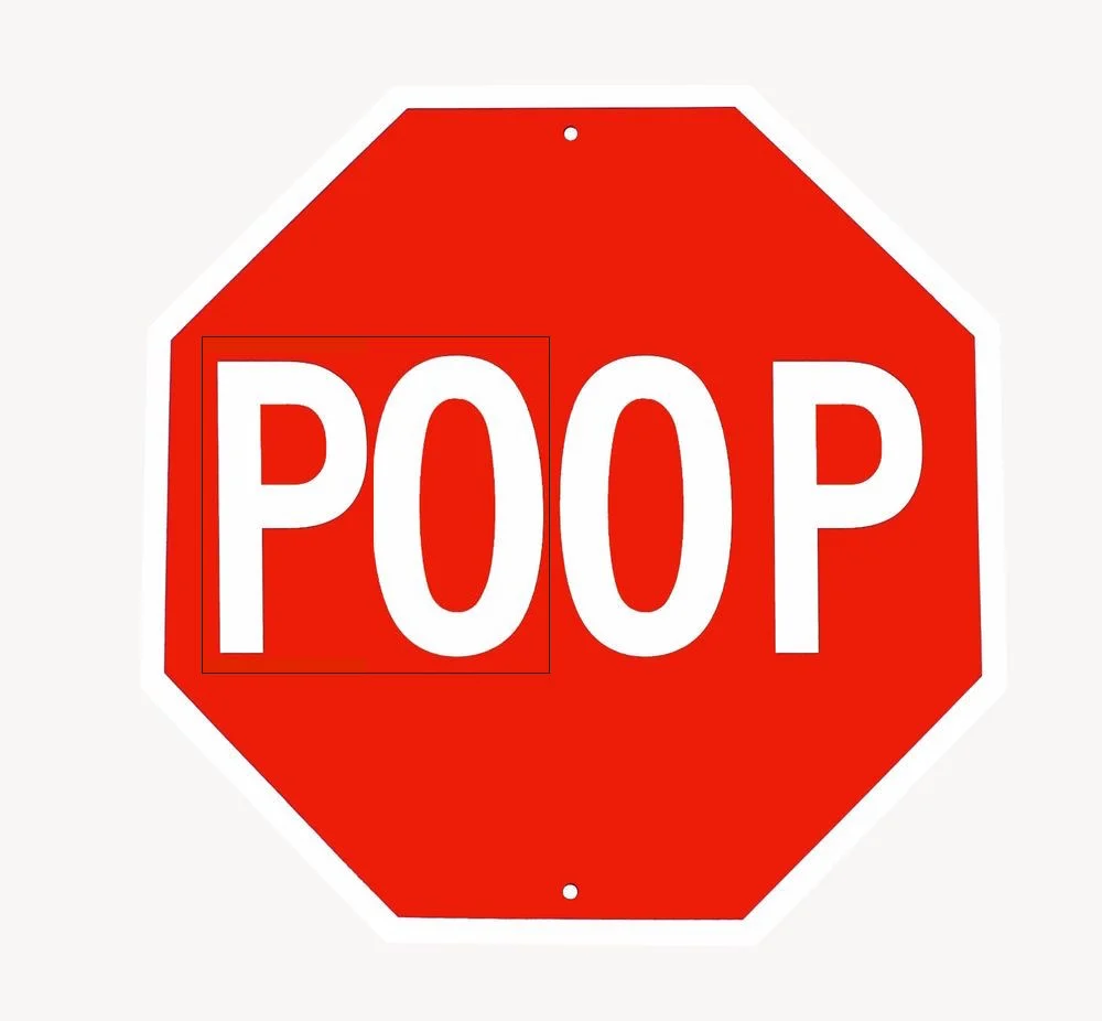
My new plan is to print hundreds of large red stickers with white block letters reading, “PO,” and distribute them widely. Then, when properly aligned, we will have communities full of “POOP,” signs instead of the traditional “STOP,” variety. That’ll show ‘em.
